
Programmatic Menus in Unity Part 1: The Four Elements
I don’t like making UIs. When you give me the option to choose between designing a menu by hand or defining it through code, I’ll do the latter every time. So when I came to terms with the fact that every single Unity game I made would need a menu, I looked to see if there was any tutorials online that explained how to make menus through code.
I wasn’t able to find any, and I resigned myself to my fate of hand-crafting every single menu I made. Don’t get me wrong, if you know what you’re doing, hand-crafting menus will look better every time. Unfortunately, I don’t know what I’m doing.
Fortunately, I do know how to code.1
(Spoilers for these blog posts: This is the core of a library I wrote, Menutee, available here.)
Driven by a desire to not reinvent the wheel with every game jam I did, I looked for some way to speed up my menu creation process, and what I found did so in spades. It’s simple to make new menus, and tweak existing ones.
This first post will cover programmatically handling the four UI elements most common in menus: buttons, toggles, sliders, and dropdowns.
The Scope
Here’s an example of the type of menus that you can generate programmatically.2
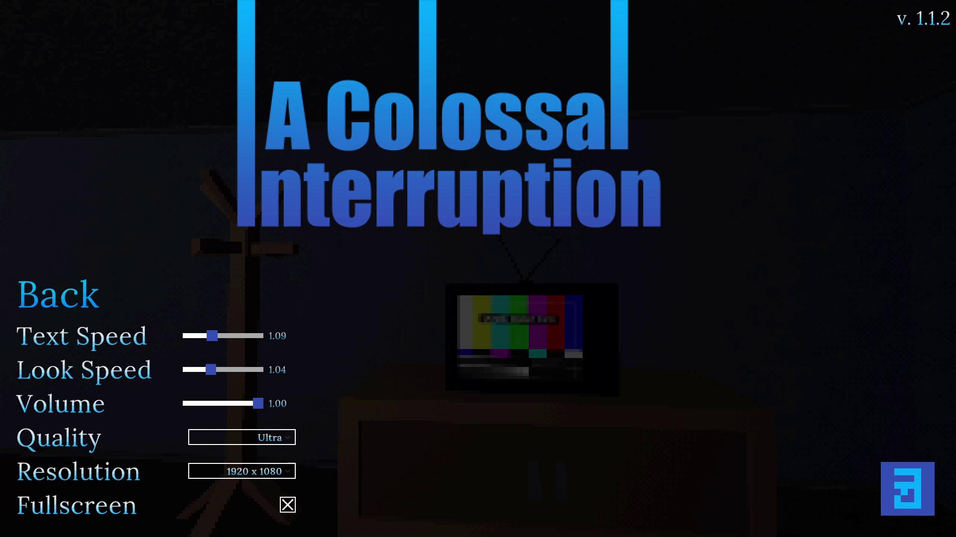
The content in the bottom left was all generated and populated programmatically.
What This Covers
Given a panel, you can specify any number of text, buttons, sliders, dropdowns, checkboxes to populate it. These are all configurable, and have results entirely in code. No more hooking up Unity events. You can press buttons to show and hide different panels.
What This Doesn’t Cover
There’s still a lot of manual creation involved. For each different type of input, you’ll have to make a template prefab. The menu traversal code only supports vertical layout (although horizontal would be easy to do), and any non-input elements will have to be set up manually. Since you can copy the templates from project to project, there’s a fairly quick base that you can build off of.
Supporting UI Elements
This approach doesn’t require full buy-in—each part of this can be done individually, and you can mix and match programmatically-generated and manually-generated content.
Each UI element we support has two components driving them: a config script, and a manager script. There’s also one overarching class that will glue the two together.
The config script is a simple C# class, and is created inside your menu layout code. The manager script is a MonoBehavior, and lives on your template prefab. Beyond giving you a reference to the object itself, the manager script will also hold references to the other elements we want to change, like a Text or Image instance. The manager script is driven by the config script, and generated by a third class, MenuGenerator, which will appear later.
All of the config objects inherit from a parent script, called PanelObjectConfig. This gives us a modicum of type safety, and provides access to a key, which can be used to select elements, or specify the first selected element.3
The config classes use a builder pattern4, as it prevents the full menu layout code from getting unwieldy. This parent class is abstract, as it doesn’t make sense for anyone to create a the class directly.
public abstract class PanelObjectConfig {
    /// <summary>
    /// Key that uniquely identifies an object within
    /// a panel. Should be unique within that scope.
    /// </summary>
    public readonly string Key;

    public PanelObjectConfig(string key) {
        Key = key;
    }

    public abstract GameObject Create(GameObject parent);

    public abstract class Builder {
        protected string _key;

        public Builder(string key) {
            _key = key;
        }

        public abstract PanelObjectConfig Build();
    }
}
In this case, having a builder feels like an incredible amount of overkill, but it sets the stage for more complicated classes to follow.
The Create() method is used as part of the menu generation process. By having the config objects handle the game object creation, we avoid having to spread the generation code for a single object across multiple locations.
Buttons
Let’s start off with the simplest interactable UI element: buttons. Functionally, buttons have two attributes: the text they display, and the action they perform when they’re clicked.5 You can see it in the image above as the “Back” text, styled to not have a background.
The Config
public class ButtonConfig : PanelObjectConfig {
    public readonly string DisplayText;
    public readonly ButtonPressedHandler Handler;

    public ButtonConfig(
        string key, string displayText, ButtonPressedHandler handler)
            : base(key) {
        DisplayText = displayText;
        Handler = handler;
    }

    public override GameObject Create(GameObject parent) {
        GameObject go = Object.Instantiate(Prefab, parent.transform);
        go.name = Key;
        ButtonManager manager = go.GetComponent<ButtonManager>();
        if (manager == null) {
            Debug.LogWarning("Button prefab does not contain ButtonManager. Menu generation will not proceed normally!");
        } else {
            manager.SetText(DisplayText);
            manager.ButtonPressed += Handler;
        }
        return go;
    }

    public new class Builder : PanelObjectConfig.Builder {
        private string _displayText;
        private ButtonPressedHandler _handler;

        public Builder(string key) : base(key) {
        }

        public Builder SetDisplayText(string displayText) {
            _displayText = displayText;
            return this;
        }

        public Builder SetButtonPressedHandler(ButtonPressedHandler handler) {
            _handler = handler;
            return this;
        }

        public override PanelObjectConfig Build() {
            return new ButtonConfig(_key, _displayText, _handler);
        }
    }
}
As you can tell from the length of the script for this fairly simple class, there’s a lot of boilerplate. That will be common across all the config classes. Thankfully, we only need to write them each once and they’re done.
The display text determines the button’s text, and the button pressed handler is an anonymous function that is called when the button is pressed.6
If you haven’t seen a builder object before, it might seem strange that the setters return an instance to the object itself. This is so you can chain them together. For instance, you could create a built ButtonConfig object in the following one-liner7:
new ButtonConfig.Builder("button").SetDisplayTest("My Button!")
    .SetButtonPressedHandler(delegate (ButtonManager manager) {
        Debug.Log("Pressed button!");
    }).Build();
The contents of the Create() method should be fairly straightforward. We instantiate the template, give it a somewhat readable name for debugging purposes, validate that the template has the ButtonManager8 script that we need, and set the text and the callback.
The Manager
public delegate void ButtonPressedHandler(ButtonManager button);
[RequireComponent(typeof(Button))]
public class ButtonManager : MonoBehaviour {
    public int Id;
    public TextMeshProUGUI Text;

    public event ButtonPressedHandler ButtonPressed;

    void Awake() {
        Button button = GetComponent<Button>();
        button.onClick.AddListener(ButtonWasPressed);
    }

    void ButtonWasPressed() {
        ButtonPressed?.Invoke(this);
    }

    public void SetText(string newText) {
        if (Text != null) {
            Text.text = newText;
        }
    }
}
This script is fairly simple: it grabs a reference to the button on startup (guaranteed to be there because of the [RequireComponent(typeof(Button))]) and registers itself as a listener on the onClick callback9 (this is the programmatic alternative to the callback you can specify in the inspector for buttons).
If you’re not using Text Mesh Pro for text,10 the reference to TextMeshProUGUI can be replaced with Text. This will also be true in all of the other managers, which either reference TextMeshProUGUI or a similar class.
Toggles
Toggles are UI elements that come with a checkbox and a corresponding label. They can be toggled on or off, and work well for binary options.11 In the image above, you can see it being used in the fullscreen options.
The Config
public class ToggleConfig : PanelObjectConfig {
    public readonly string DisplayText;
    public readonly bool IsOn;
    public readonly TogglePressedHandler Handler;

    public ToggleConfig(string key, string displayText, bool isOn,
            TogglePressedHandler handler) : base(key) {
        DisplayText = displayText;
        IsOn = isOn;
        Handler = handler;
    }

    public override GameObject Create(GameObject parent) {
        GameObject go = Object.Instantiate(Prefab, parent.transform);
        go.name = Key;
        ToggleManager manager = go.GetComponent<ToggleManager>();
        if (manager == null) {
            Debug.LogWarning("Toggle prefab does not contain ToggleManager. Menu generation will not proceed normally!");
        } else {
            manager.SetToggled(IsOn);
            manager.SetText(DisplayText);
            manager.TogglePressed += Handler;
        }
        return go;
    }

    public new class Builder : PanelObjectConfig.Builder {
        private string _displayText;
        private TogglePressedHandler _handler;
        private bool _isOn;

        public Builder(string key, bool isOn) : base(key) {
            _isOn = isOn;
        }

        public Builder SetDisplayText(string displayText) {
            _displayText = displayText;
            return this;
        }

        public Builder SetTogglePressedHandler(TogglePressedHandler handler) {
            _handler = handler;
            return this;
        }

        public override PanelObjectConfig Build() {
            return new ToggleConfig(_key, _displayText, _isOn, _handler);
        }
    }
}
The display text behaves the same as it does on the button: setting the text alongside the toggle. The toggle’s initial state is determined by isOn, and TogglePressedHandler is called when the toggle is, well, toggled.
An example ToggleConfig:
new ToggleConfig.Builder("example toggle")
    .SetDisplayTest("Checked")
    .SetIsOn(true)
    .SetTogglePressedHandler(delegate (ToggleManager manager, bool newValue) {
        Debug.LogFormat("Toggled state: {0}", newValue);
    }).Build();
As with the button’s Create(), there shouldn’t be much surprising here. One caveat is that, at least for how I do it, this menu is generated on scene start and persists for the entirety of the scene. If you add a way to toggle an option without going through the menu, you will need to make sure that that new state is reflected in the menu. This is also true in the other menu elements that maintain state.
The Manager
public delegate void TogglePressedHandler(ToggleManager toggle, bool on);
public class ToggleManager : MonoBehaviour {
    public event TogglePressedHandler TogglePressed;

    public TextMeshProUGUI Text;
    public Toggle Toggle;

    void Awake() {
        Toggle.onValueChanged.AddListener(ToggleWasPressed);
    }

    public void SetText(string newText) {
        if (Text != null) {
            Text.text = newText;
        }
    }

    public void SetToggled(bool newValue) {
        Toggle.SetIsOnWithoutNotify(newValue);
    }

    void ToggleWasPressed(bool newValue) {
        TogglePressed?.Invoke(this, newValue);
    }
}
onValueChanged is how you programmatically add a listener to a toggle button. The toggle state is set with a call to SetIsOnWithoutNotify, to prevent a callback from being set for the initial state.
This script doesn’t include RequiresComponent, as my implementation of the toggle prefab had the Toggle element as a child of the object the manager was on. You can change this if it’s not applicable to your project, or just hook the Toggle up to ToggleManager in the inspector.
Sliders
Sliders allow the user to choose a number in a range. It’s ideal for cases like a volume option, where a binary on/off option doesn’t cover the options the player might want. In the image at the start, you can see it with the volume, look speed, or text speed options.
The Config
public class SliderConfig : PanelObjectConfig {
    public string DisplayText;
    public float MinValue;
    public float MaxValue;
    public float DefaultValue;
    public SliderUpdatedHandler Handler;

    public SliderConfig(string key, string displayText, float minValue,
            float maxValue, float defaultValue, SliderUpdatedHandler handler)
            : base(key) {
        DisplayText = displayText;
        MinValue = minValue;
        MaxValue = maxValue;
        DefaultValue = defaultValue;
        Handler = handler;
    }

    public override GameObject Create(GameObject parent) {
        GameObject go = Object.Instantiate(Prefab, parent.transform);
        go.name = Key;
        SliderManager manager = go.GetComponent<SliderManager>();
        if (manager == null) {
            Debug.LogWarning("Slider prefab does not contain SliderManager. Menu generation will not proceed normally!");
        } else {
            manager.SetRange(MinValue, MaxValue);
            manager.SetValue(DefaultValue);
            manager.SetText(DisplayText);
            manager.SliderUpdated += Handler;
        }
        return go;
    }

    public new class Builder : PanelObjectConfig.Builder {
        private string _displayText;
        private SliderUpdatedHandler _handler;
        private float _minValue;
        private float _maxValue;
        private float _defaultValue;

        public Builder(string key, float minValue, float maxValue,
                float defaultValue) : base(key) {
            _minValue = minValue;
            _maxValue = maxValue;
            _defaultValue = defaultValue;
        }

        public Builder SetDisplayText(string displayText) {
            _displayText = displayText;
            return this;
        }

        public Builder SetSliderUpdatedHandler(SliderUpdatedHandler handler) {
            _handler = handler;
            return this;
        }

        public override PanelObjectConfig Build() {
            return new SliderConfig(_key, _displayText, _minValue, _maxValue,
                _defaultValue, _handler);
        }
    }
}
If you’re unfamiliar with the builder pattern, you may be wondering why I pass make the caller pass some arguments into the constructor, and some arguments through setter methods. The four arguments in the constructor are parameters that are required for the created slider to function: it doesn’t make sense to have a slider without a min value or a max value.
Similarly, not setting the default value feels like a mistake.12 Forcing the caller to set all three of them at the same time would also allows us to do some simple sanity checks, like ensuring that minValue <= defaultValue <= maxValue.
On the other hand, a slider doesn’t strictly need display text to function, so that’s optional. It’s also less likely, but you may not want a slider update callback. The object can function without them.13
An example SliderConfig:
new SliderConfig.Builder("example slider", 0f, 10f, 5f)
    .SetDisplayText("Slider")
    .SetSliderUpdatedHandler(
        delegate (SliderManager manager, float newValue) {
            Debug.LogFormat("Slider value: {0}", newValue);
        }
    ).Build();
The code in the Create() method should feel very familiar by now.
The Manager
public delegate void SliderUpdatedHandler(
        SliderManager manager, float newValue);
public class SliderManager : MonoBehaviour {
    public Slider Slider;
    public TextMeshProUGUI Text;

    public event SliderUpdatedHandler SliderUpdated;

    void Awake() {
        Slider.onValueChanged.AddListener(SliderValueUpdated);
    }

    public void SetText(string newText) {
        if (Text != null) {
            Text.text = newText;
        }
    }

    public void SetRange(float min, float max) {
        Slider.minValue = min;
        Slider.maxValue = max;
    }

    public void SetValue(float value) {
        Slider.SetValueWithoutNotify(value);
    }

    void SliderValueUpdated(float newValue) {
        SliderUpdated?.Invoke(this, newValue);
    }
}
This code, like the other element managers, may look like you can only set one callback on SliderUpdated. Due to how delegates work, you can set as many as you’d like. Just keep calling SliderUpdated += yourCallback;.
Dropdowns
Dropdowns, as their name implies, drop down a set of options to pick from when they’re clicked upon. They’re useful when you have a discrete set of options, like a difficulty setting. Dropdowns are used in the resolution setting and the quality setting in the image at the start.
The Config
public class DropdownConfig : PanelObjectConfig {
    public readonly string DisplayText;
    public readonly string[] OptionStrings;
    public readonly int DefaultIndex;
    public readonly DropdownChosenHandler Handler;

    public DropdownConfig(string key, string displayText,
            string[] optionStrings, int defaultIndex,
            DropdownChosenHandler handler) : base(key) {
        DisplayText = displayText;
        OptionStrings = optionStrings;
        DefaultIndex = defaultIndex;
        Handler = handler;
    }

    public override GameObject Create(GameObject parent) {
        GameObject go = Object.Instantiate(Prefab, parent.transform);
        go.name = Key;
        DropdownManager manager = go.GetComponent<DropdownManager>();
        if (manager == null) {
            Debug.LogWarning("Dropdown prefab does not contain DropdownManager. Menu generation will not proceed normally!");
        } else {
            manager.SetText(DisplayText);
            manager.SetOptions(OptionStrings, DefaultIndex);
            manager.DropdownChosen += Handler;
        }
        return go;
    }

    public new class Builder : PanelObjectConfig.Builder {
        private string _displayText;
        private List<string> _optionStrings = new List<string>();
        private int _defaultIndex;
        private DropdownChosenHandler _handler;

        public Builder(string key) : base(key) {
        }

        public Builder SetDisplayText(string displayText) {
            _displayText = displayText;
            return this;
        }

        public Builder SetDropdownChosenHandler(
                DropdownChosenHandler handler) {
            _handler = handler;
            return this;
        }

        public Builder AddOptionStrings(IEnumerable<string> options) {
            _optionStrings.AddRange(options);
            return this;
        }

        public Builder AddOptionString(string option,
                bool defaultOption = false) {
            int newIdx = _optionStrings.Count;
            _optionStrings.Add(option);
            if (defaultOption) {
                _defaultIndex = newIdx;
            }
            return this;
        }

        public Builder SetDefaultOptionIndex(int idx) {
            _defaultIndex = idx;
            return this;
        }

        public override PanelObjectConfig Build() {
            return new DropdownConfig(
                _key, _displayText, _optionStrings.ToArray(), _defaultIndex,
                _handler);
        }
    }
}
The dropdown config. Here’s one of the cases where having a builder shines: you can add dropdown options one at a time, and set the default option at the same time, while still getting an immutable class.
An example DropdownConfig:
builder.AddPanelObject(new DropdownConfig.Builder("example dropdown")
    .SetDisplayText("Dropdown")
    .AddOptionString("Option 1")
    .AddOptionString("2")
    .AddOptionString("Third option", true)
    .AddOptionString("Option 4")
    .AddOptionString("Another option")
    .SetDropdownChosenHandler(
        delegate (DropdownManager manager, int newIndex,
                    string optionString) {
            Debug.LogFormat("Chose {0} at index {1}", optionString, newIndex);
        }
    ).Build();
The Create() methods that I have in these classes used to be part of the upcoming MenuGenerator class, but pulling that method out into the config objects made following the logic more straightforward, and allows adding new config types without modifying the MenuGenerator class, which makes both classes more maintainable.
The Manager
public delegate void DropdownChosenHandler(
    DropdownManager dropdown, int index, string option);
public class DropdownManager : MonoBehaviour {
    public event DropdownChosenHandler DropdownChosen;

    public TextMeshProUGUI Text;
    public TMP_Dropdown Dropdown;
    public Toggle Template;

    private string[] _options;

    void Awake() {
        Dropdown.onValueChanged.AddListener(DropdownChosenInternal);
    }

    public void SetText(string newText) {
        if (Text != null) {
            Text.text = newText;
        }
    }

    public void SetOptions(string[] options, int index) {
        _options = options;

        Dropdown.ClearOptions();
        List<TMP_Dropdown.OptionData> optionDatas =
            new List<TMP_Dropdown.OptionData>();
        for (int i = 0; i < options.Length; i++) {
            optionDatas.Add(new TMP_Dropdown.OptionData(options[i]));
        }
        Dropdown.AddOptions(optionDatas);
        Dropdown.SetValueWithoutNotify(index);
    }

    void DropdownChosenInternal(int newIndex) {
        DropdownChosen?.Invoke(this, newIndex, _options[newIndex]);
    }
}
Dropdowns are more complicated than other UI elements, so they also get a more complicated manager.14 In SetOptions, all of the options are added to the dropdown. An intermediary listener is also added that expands the callback information to also get the string option selected. Dropdowns also support callbacks through onValueChanged.
It’s Elementary
I had intended to cover everything in one post, but this ended up ballooning out to be far too long. I guess that’s what happens when you embed entire classes in your code.
Let this should serve as inspiration if you want to set up menus programmatically in your own way. Or, if you just want them to work and don’t care about making them work yourself, you can check out the next post in the series.
-
More or less. ↩︎
-
This is the options menu from A Colossal Interruption, a retro horror-themed walking sim that I made for a weekend game jam. After hand-crafting the menus to get it done within the jam timeline, I was driven to finally automate it. I subsequently redid the menus in this new system with minimal differences. ↩︎
-
Used for controller and keyboard menu support. ↩︎
-
A builder pattern is when you create a separate class (the builder) to coordinate the creation of the base object. This has a variety of benefits, like moving object creation complexity out of the base object, avoiding the use of constructors with large amounts of parameters, and specifying optional parameters in an easy-to-read way. ↩︎
-
The also tend to have a background image, but the code down below won’t support changing it. It should be easy enough to add support for; you can expose the image attribute of the button in the manager script and change it from there. ↩︎
-
I know, surprising behavior, given the name. ↩︎
-
Well, it could technically fit on one line, at least. ↩︎
-
See right after this sentence. ↩︎
-
Despite what the name might imply, this is also called on keyboard and controller input. ↩︎
-
You should consider it, if you aren’t. It gives you a lot more flexibility with rendering style, and looks much crisper. ↩︎
-
Both examples that first came to mind when trying to think of an example (a fullscreen toggle and a subtitles toggle) are examples where you also might want to use a dropdown. ↩︎
-
Due to how the builder works, it would get set to zero, but that’s not a safe default for all slider. ↩︎
-
It can also function without a default value. Choosing where things are set, constructor or setter, allows you to apply discretion. ↩︎
-
Setting up individual dropdown objects is a pain in menus as well, especially if you want to theme the whole thing. Off the top of my head, I can recall two different items you have to theme, and they are somewhat hidden away. ↩︎